Home | Web Services Digital Accessibility Compliance
Home |
eSign is universally accessible, meaning it works on every browser or device that users access it on, meaning users can access and use all the information and features they need, regardless of which browser they use.
eSign operates across the following:
eSign supports the latest stable release of these browsers:
eSign can accept almost any kind of file types for uploading. The system always outputs a tamper proof PDF.
Headings should be properly levelled using relevant <h1> to <h6> tags so that screen readers can jump to the content they are looking for. Bold text or bigger font sizing is not recognized by screen readers or speech recognition software as styling is ignored.
The web page should still function and have a recognizable content flow when stylesheets are disabled, important information and relevant tasks must still be completable without styling.
Only sighted users will understand instructions like:
This style of instruction should be avoided as to not inhibit users.
Instructions should not rely on a user’s ability to see the page content.
Links should clearly show where the user will be directed, links should make sense in isolation without surrounding context.
Avoid using text like ‘Click here’ or ‘more information’ as the link information does not describe the endpoint.
Pages should be titled descriptively, or users may struggle to find what they are looking for.
For example, ‘Apply for a blue badge – Danbury Council’ is a much more descriptive title than just ‘Blue badges’.
Also check that none of the titles are duplicated: if 2 pages have the same title, how is the user supposed to know which one to use?
Images that are non-decorative (including charts) should have an accompanying text description to describe the image.
The alt property should be effectively used or text in the body alongside the image should be used.
Videos should have options for captions or should have transcripts available.
https: //support.google.com/youtube/answer/2734796?hl=en-GB
A second audio track may be required for videos that contain chart or photo information that is not directly described in the video, users who are only following the audio may miss important content otherwise.
Screen readers will not pick up any information that is inside an image as they are not visible in the raw text, where possible the information inside the image should also be present in the body of the page as text.
Forms should be labelled appropriately. Clicking the label of the form should make the cursor appear in the input field if the form is correctly labelled.
The information required by the user should be clear in the label, labels should be specific and clear.
Elements should be consistent across pages, if submit is used for one form and Go or Complete are used for other forms, they do not follow the consistency rule.
Users should receive a timeout warning if they are to be logged out for a period of inactivity.
Messages like ‘Error’ or ‘Invalid’ are not helpful. Instead use descriptive errors like ‘You cannot enter a date in the future –please enter a past date’.
Users should be able to review input before submitting to legally binding, financial or important forms or contracts, this is best done by redirecting to a review page before submission.
Elements should behave the way their tags define, e.g. redirecting from a radio button or opening a menu with a video should be avoided.
Users should be able to navigate pages with one finger in any orientation without the use of complex motions.
The order of a webpage should make sense when tabbing, the user should be able to navigate around the page with a keyboard.
Nothing unexpected should happen whilst tabbing through a webpage, e.g., opening a new webpage or menu.
All forms should be accessible without a mouse.
Users should be able to skip to a page’s main content.
The webpage should still have full functionality whilst the user has the page magnified.
The web page and its content should still function when text has been enlarged.

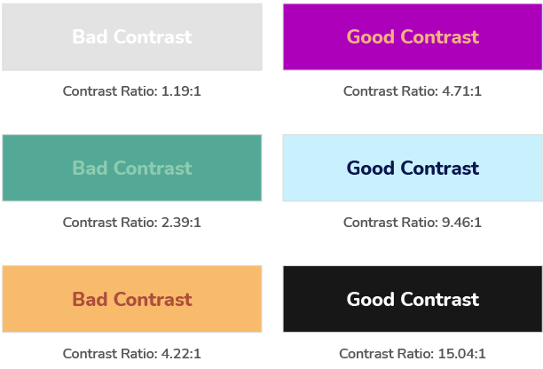
Text to background contrast should be at least 4.5:1.

Things like scrolling carousels or blinking images can be very distracting for people with cognitive disabilities. The user should be able to disable them.

Content that is looped or longer than 3 seconds should have the option to be stopped or disabled.

Where possible elements should use tags that correctly describe their content e.g. list tags should use list tags etc.
